Apple - App Store Identity
When apps were first introduced to the world, every day was an exciting new discovery. Since then, keeping track of what’s out there has become overwhelming and consequently the magic of finding new apps has been lost.
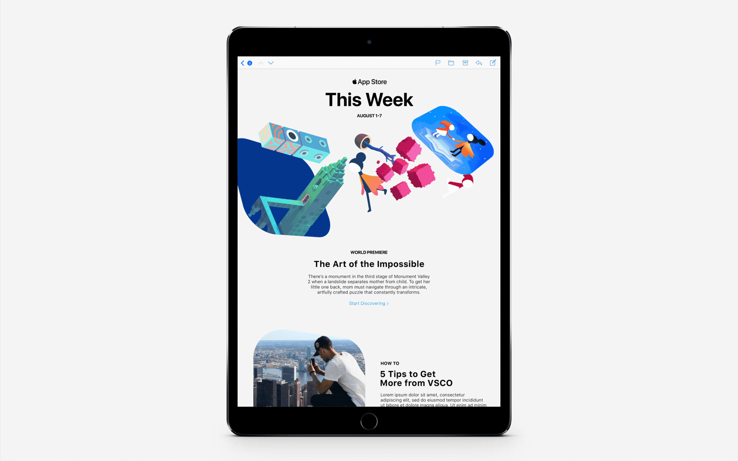
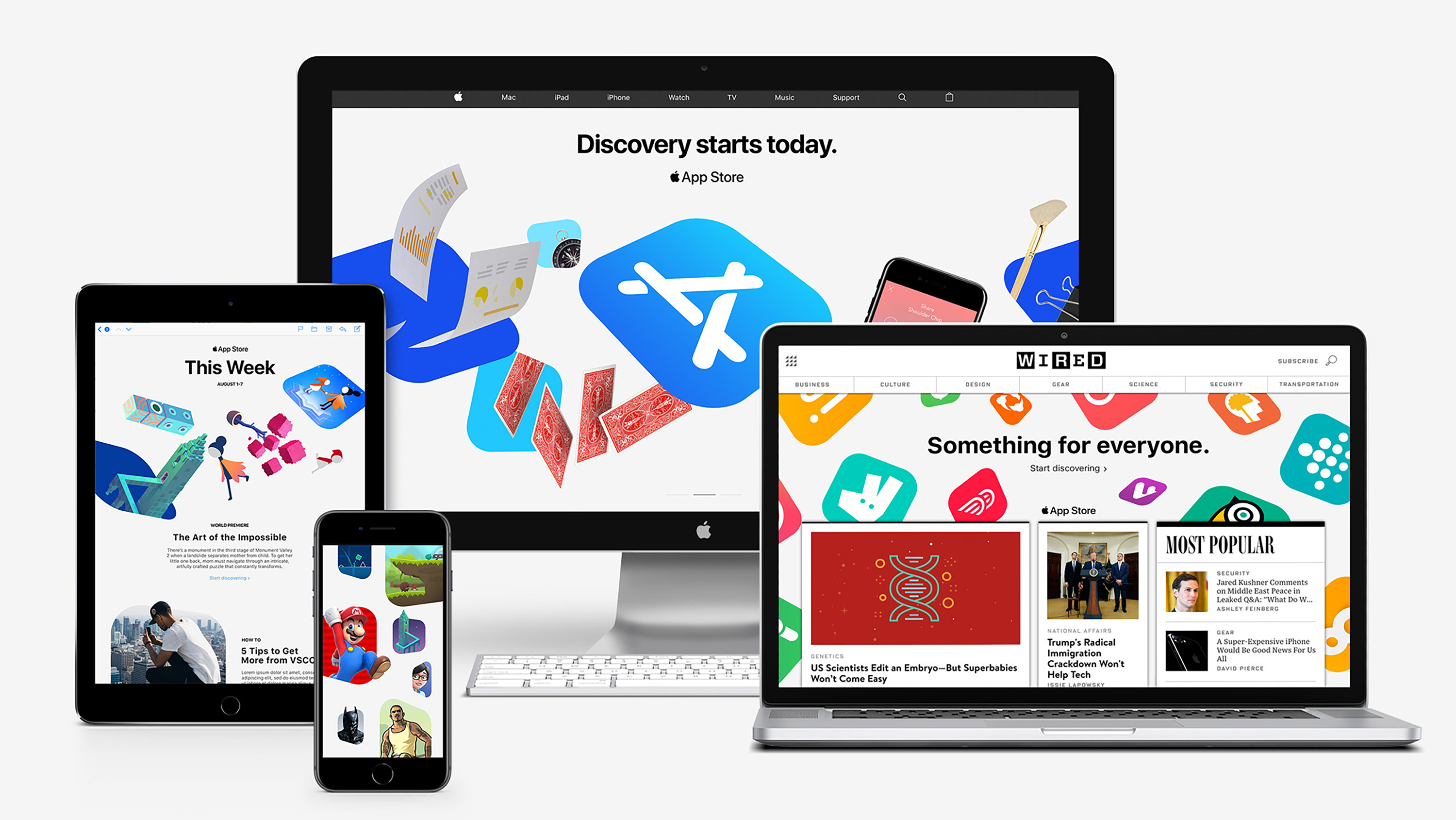
To recapture that excitement, Apple recently overhauled their App Store to be a destination for discovery with a new ‘Today’ tab, jam-packed with editorial content to bring back the excitement. To promote the new product we were asked to give the App Store its own unique voice and visual identity within the Apple ecosystem. Our solution: a system that’s alive; crackling with energy, excitement and potential–a world unto itself, bursting with other worlds just waiting to be explored.
When apps were first introduced to the world, every day was an exciting new discovery. Since then, keeping track of what’s out there has become overwhelming and consequently the magic of finding new apps has been lost.
To recapture that excitement, Apple recently overhauled their App Store to be a destination for discovery with a new ‘Today’ tab, jam-packed with editorial content to bring back the excitement. To promote the new product we were asked to give the App Store its own unique voice and visual identity within the Apple ecosystem. Our solution: a system that’s alive; crackling with energy, excitement and potential–a world unto itself, bursting with other worlds just waiting to be explored.
Core Idea
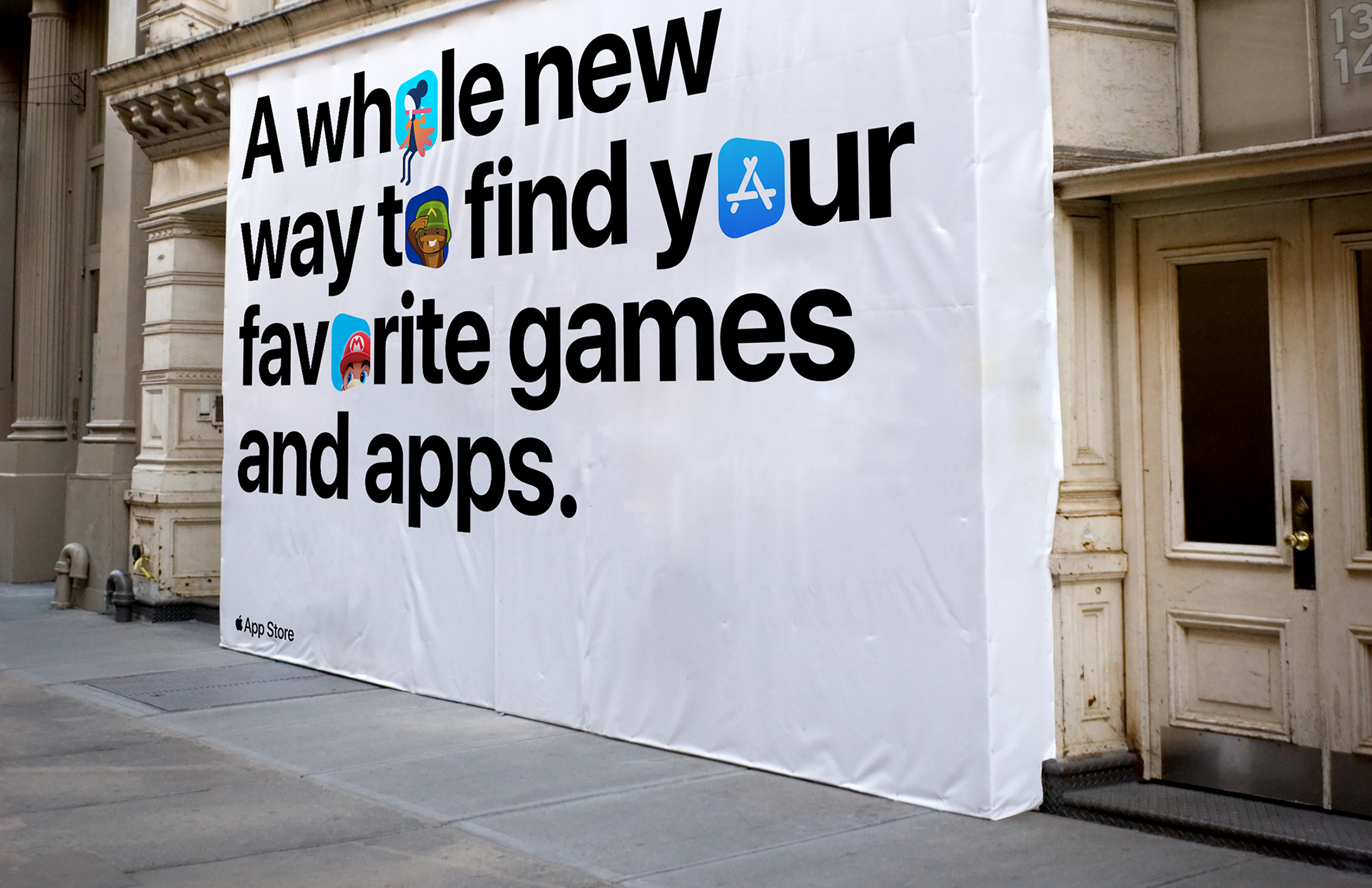
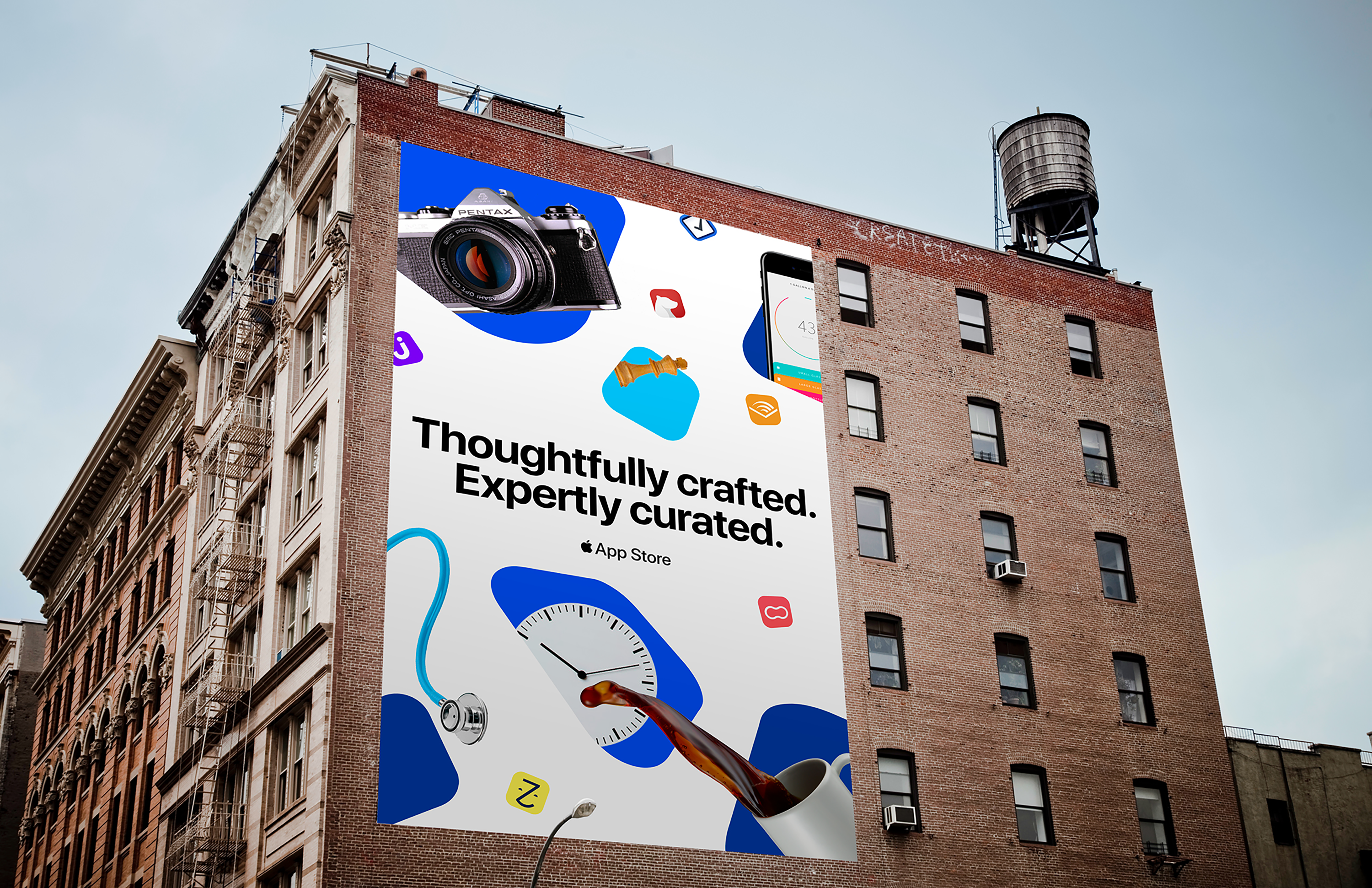
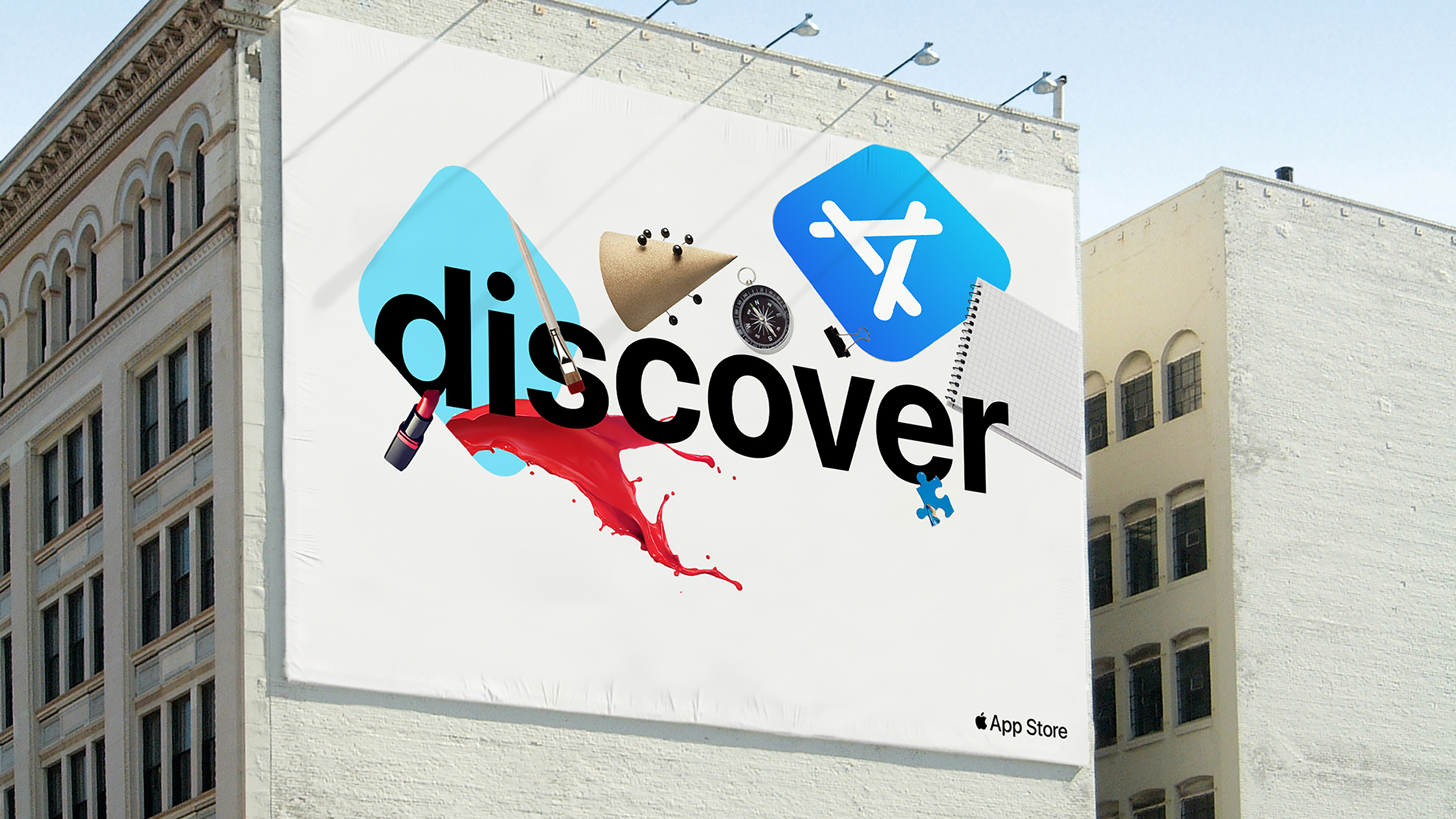
We set out to present the App Store as a vibrant and energetic world of apps waiting to be discovered. Taking the iconic app tile shape (known as the chiclet) as our starting point, we created a world of chiclets and portals to create a mind-bending system where contents explode from App World into our world–like blowing the cover off a manhole to let what’s inside escape.

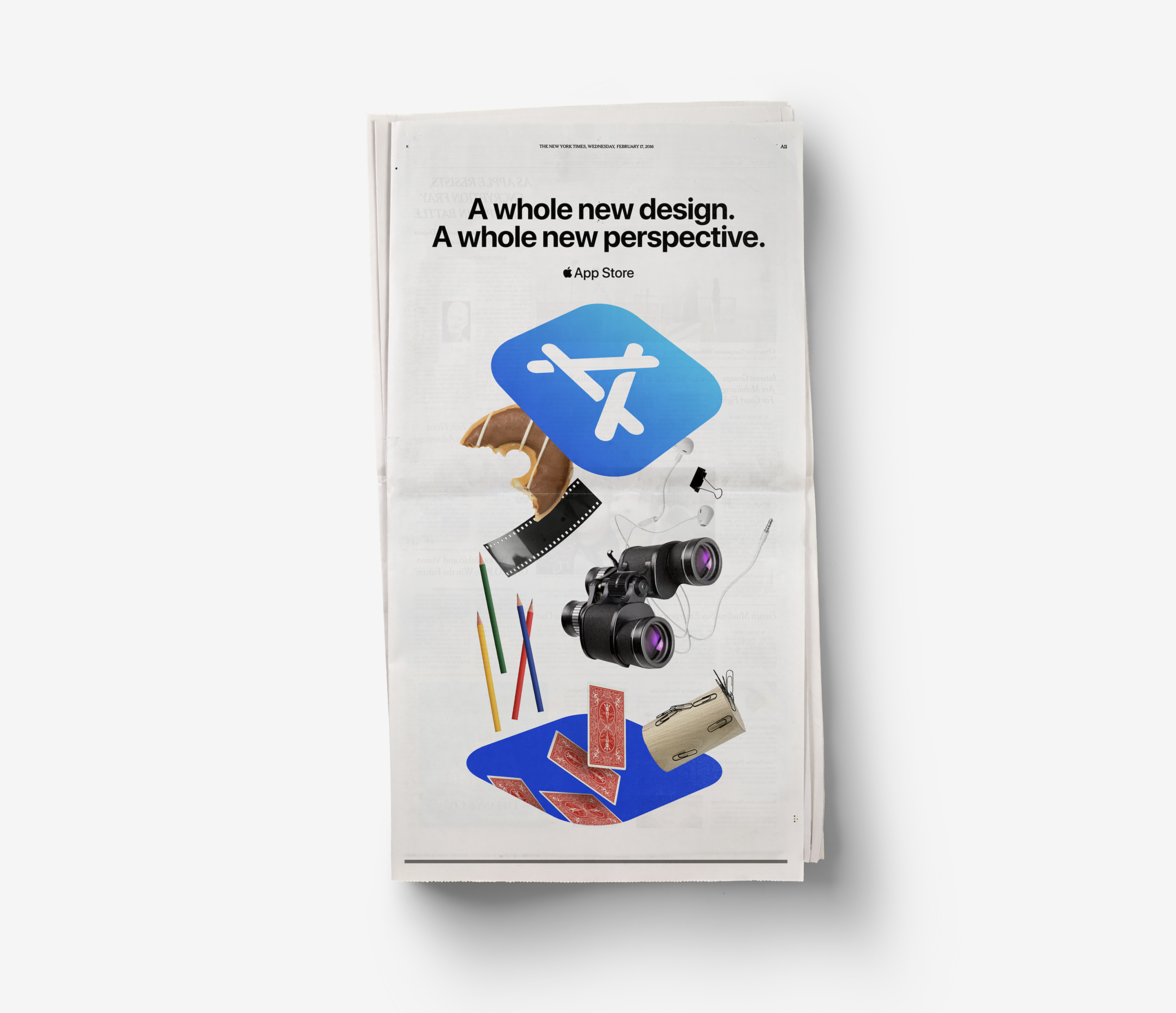
Marketing
Unlike Apple hardware and Apple Music, which each have their own distinctive marketing presence, the App Store didn’t have a unique visual language for advertising. The new identity sought to change this with a recognizable visual language for advertising. The principles we created from the outset allow for unique creative applications across in-store and out of home media, giving the App Store a recognizable in-market presence as new apps and stories are introduced without the system becoming tired or formulaic.