ZIGZAG Rebranding
Zigzag is the largest shopping app in Korea, with over 35 million downloads and counting. Focused on fashion, beauty, and lifestyle, the app includes over 7,000 stores. Already popular among Gen Z in Korea, the brand needed a more precise, contemporary identity that would allow them to expand into new markets and keep pace with fashion. The rebrand updates core equities while reflecting the limitless exploration that has made Zigzag a go-to shopping destination since 2015.
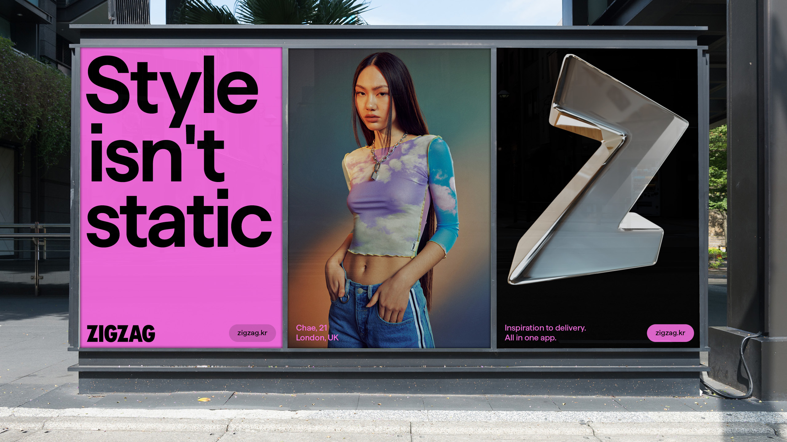
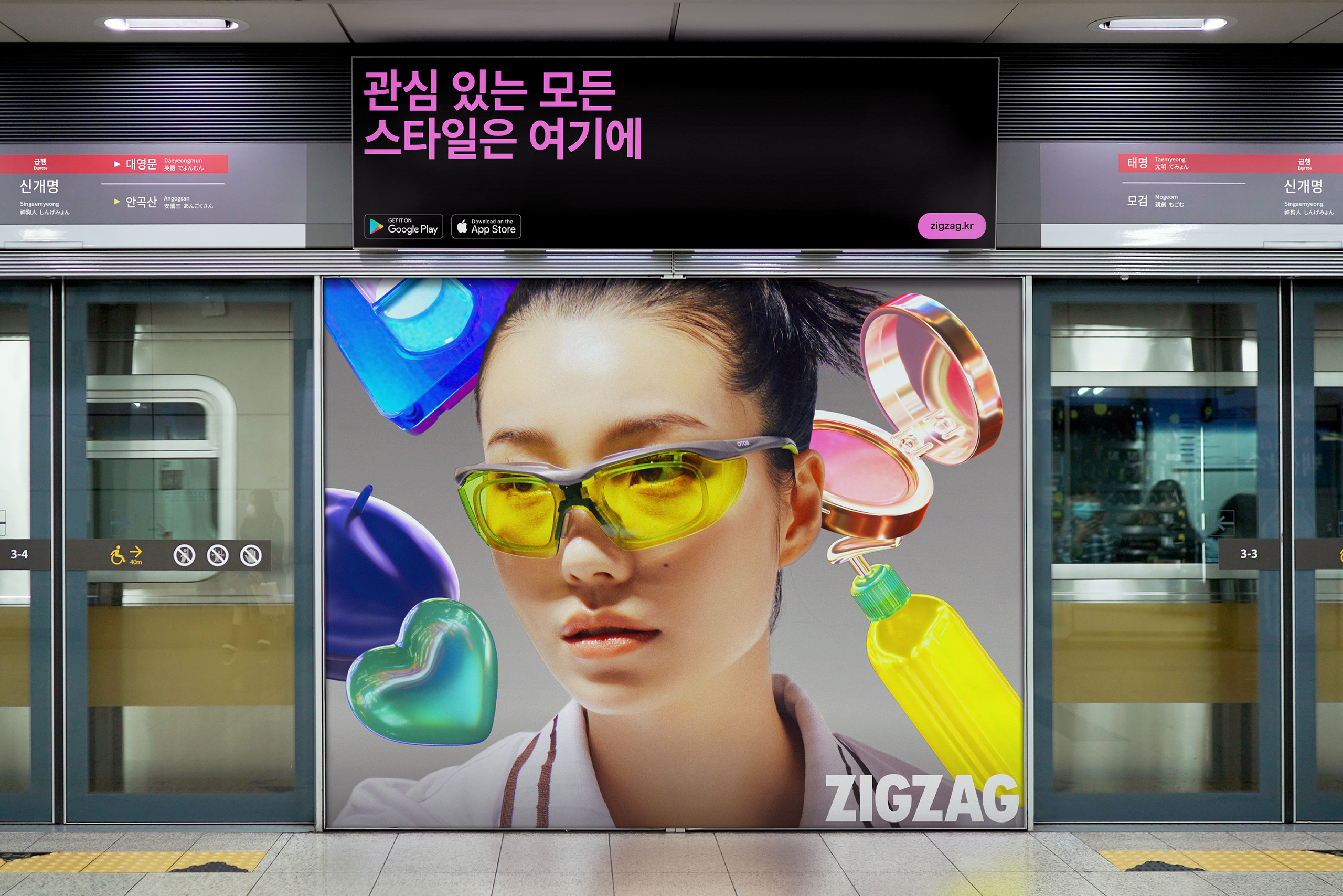
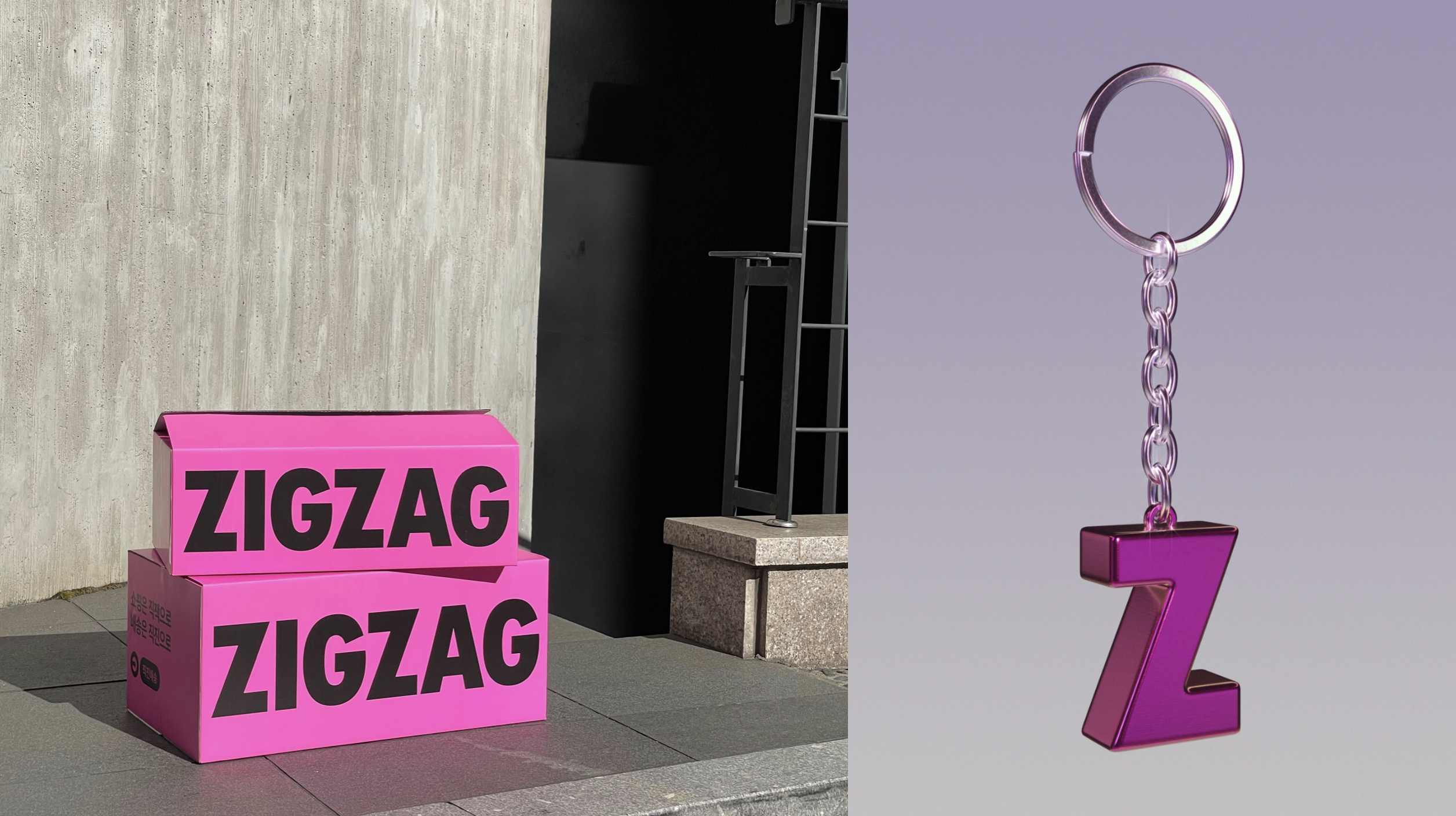
Zigzag’s evolution started with the wordmark. Drawing inspiration from the typography of fashion periodicals, we transformed an expectedly digital wordmark into one that can span from a support mechanism to a bold icon in its own right. The condensed ‘Z’ also flexes as a confident and dynamic shorthand for the brand. And just as youth styles and identities are constantly in flux, so is Zigzag’s mark — often taking on different materialities in high-fidelity 3D.
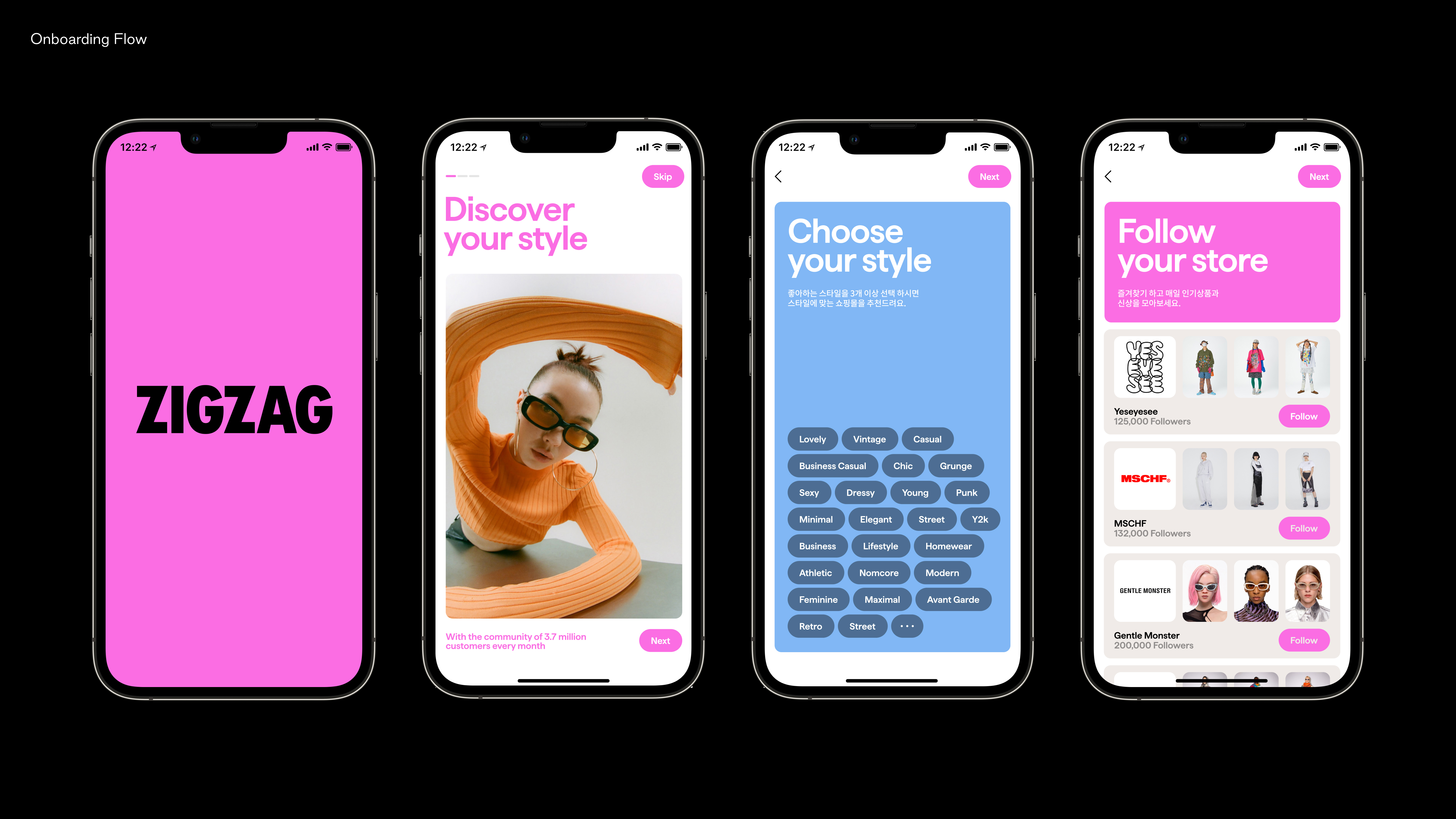
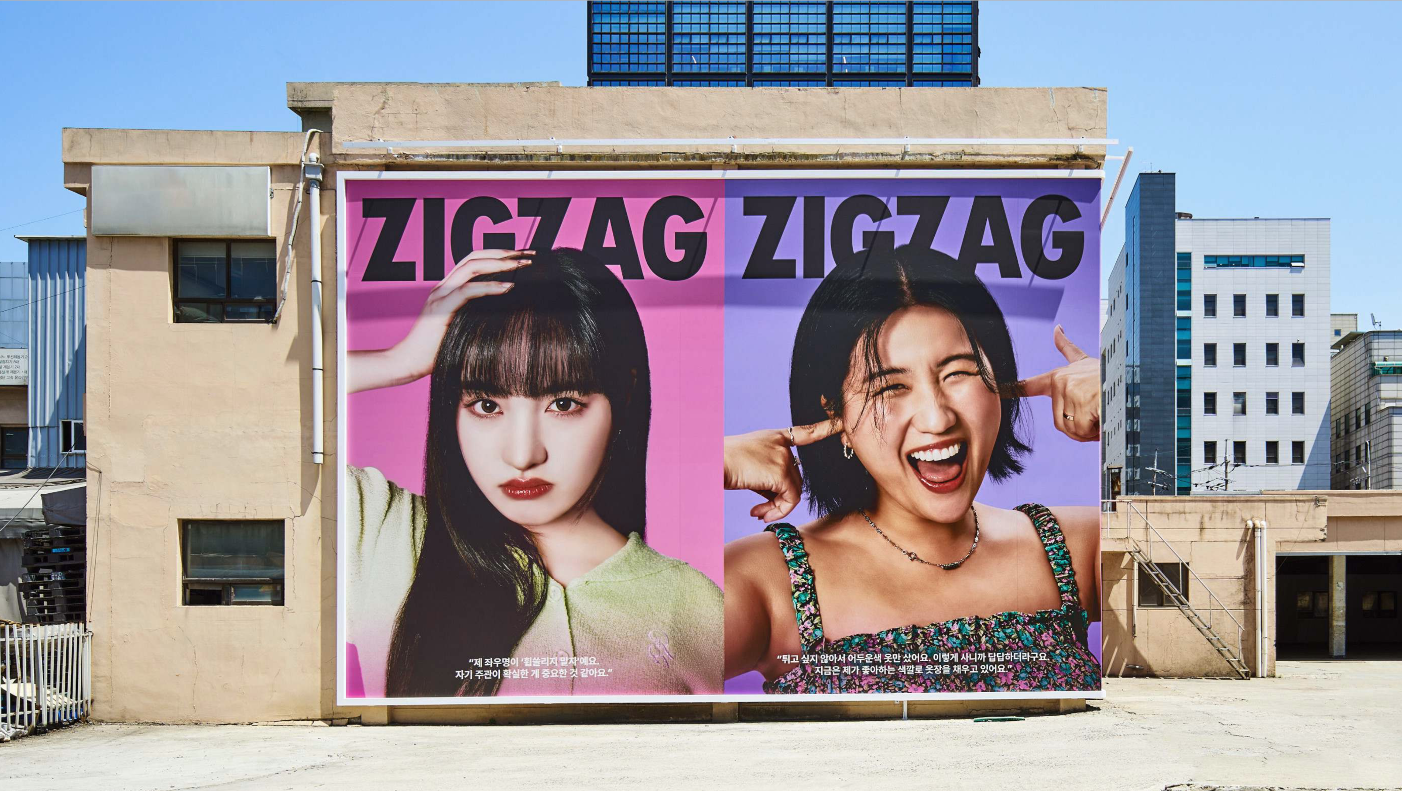
A vibrant new palette brings an energy previously missing from the identity. First, we updated Zigzag’s signature pink to be fresher, brighter, and (literally) cooler. Complementing Zigzag pink, we also built out an expansive palette that takes cues from a more youthful fashion world.
Clean sans serif typography acts as a counterbalance to the system’s more expressive elements. Both Korean and Latin typefaces selected share similar characteristics and weights, allowing the brand to communicate seamlessly across multiple languages.
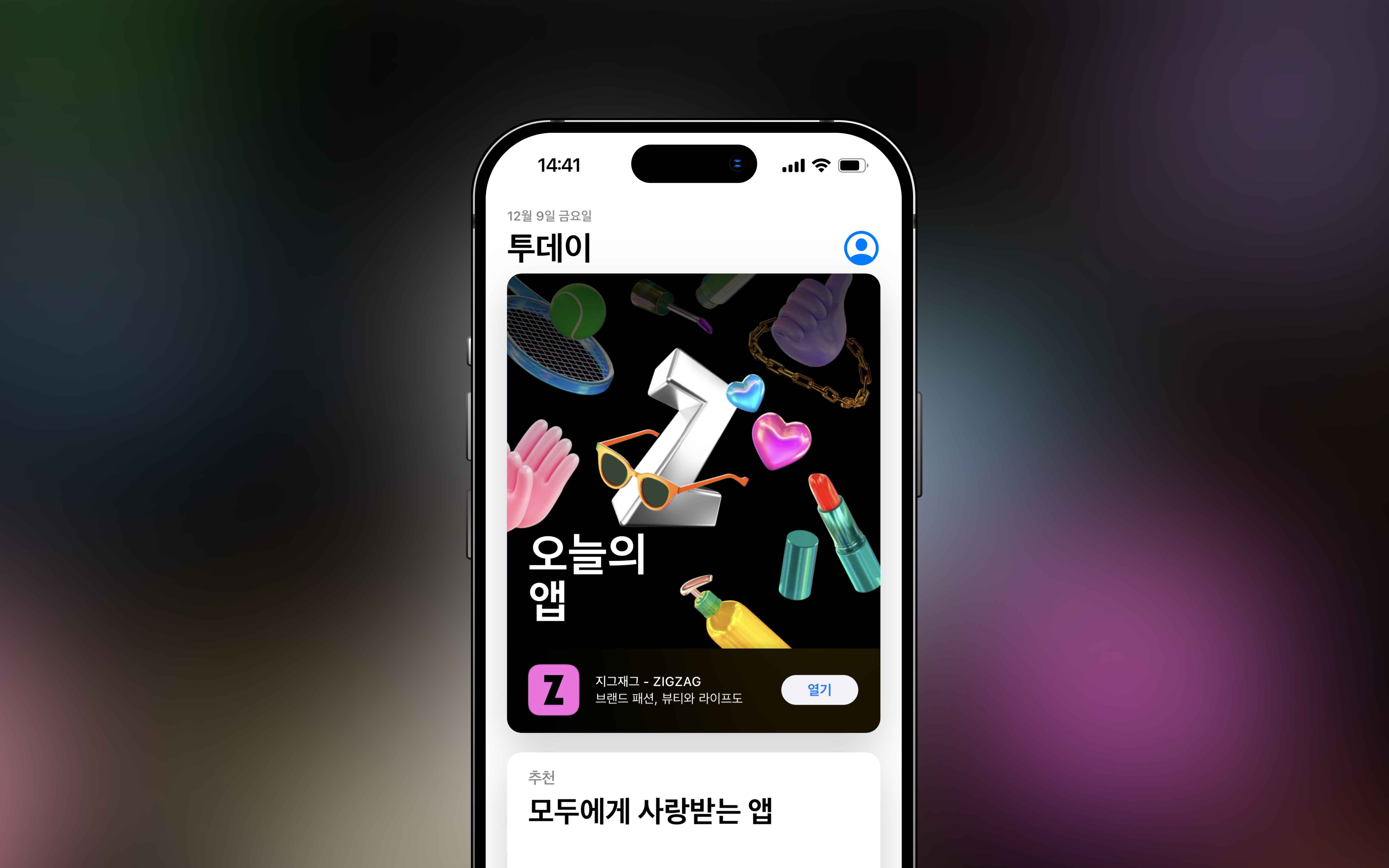
A new photography system brings together exuberant, editorial brand shots with more casual UGC that can be cut-out and recontextualized in the vernacular of fashion moodboards. We also designed a library of custom 3D ‘stickers’ with social in mind — a playful visual language that Zigzag’s community can experiment with in the context of their own IG stories.
As the brand expands into more global markets, the new identity announces Zigzag as a relevant and exciting shopping destination to explore. Trends move fast. Now Zigzag can move with them.
Detailed information about the project available upon request.
Creative Director: June Shim
Design agency: Porto Rocha
Design agency: Porto Rocha

